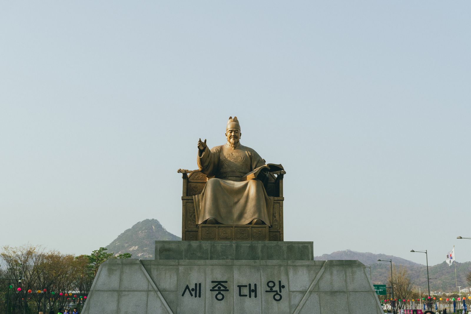
Hangeul Design: Why Korea's Alphabet Became a Global Aesthetic
Most writing systems evolved over millennia of scribbles, borrowings, and accidents. Hangeul, the Korean alphabet, was designed: commissioned, reasoned out, and published with an explanation of its own logic in the 15th century. That design DNA is why linguists praise it, why designers around the world now treat Korean letterforms as an aesthetic in their own right, and why you see Hangeul on streetwear, gallery walls, and tattoo studios far from Seoul.
This guide covers what makes Hangeul structurally beautiful, the story of its creation, how it moved from national script to global design trend, and where you can see, and shop, the best Hangeul design in Korea today.
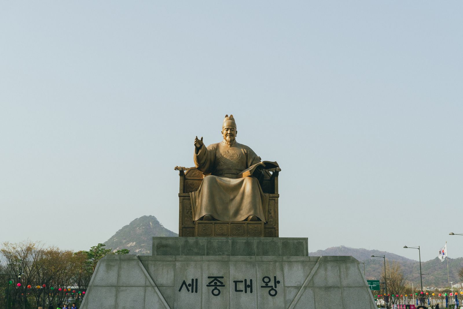
A Writing System With a Birth Certificate
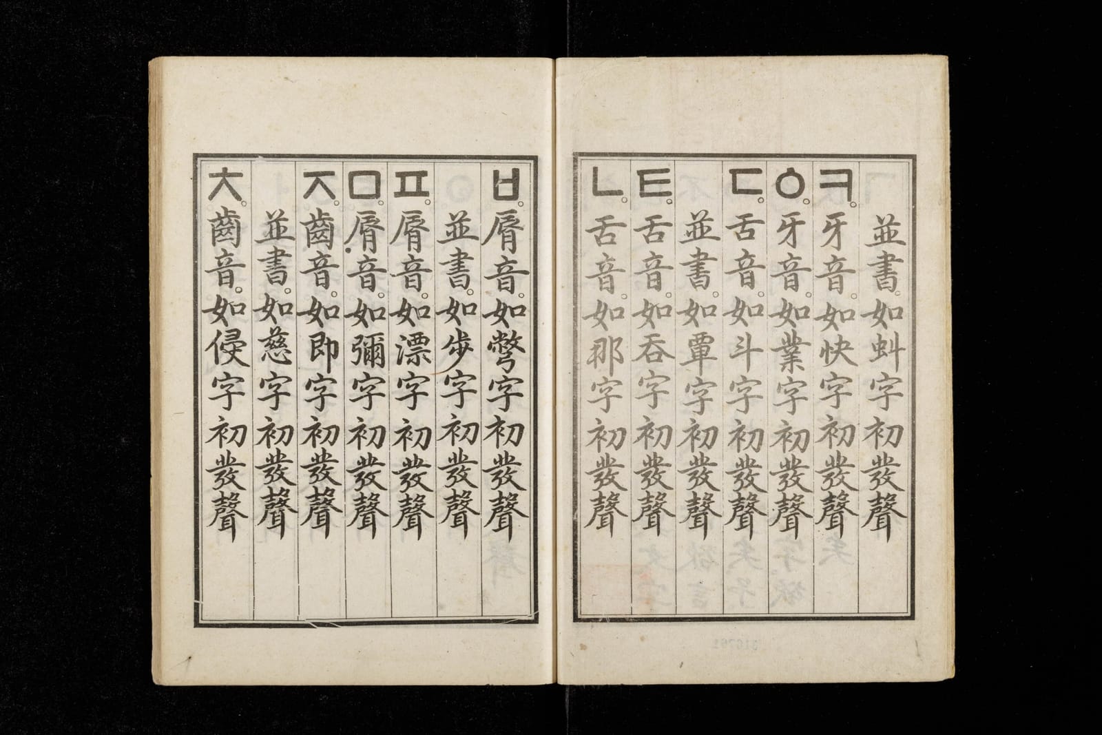
Hangeul was created under King Sejong the Great of the Joseon Dynasty, completed in 1443 and promulgated in 1446 through a document called Hunminjeongeum, "The Correct Sounds for the Instruction of the People." Before it, written Korean life ran on classical Chinese characters, which took years of privileged education to master. Sejong's stated purpose was radical for its era: a script simple enough that ordinary people could learn it and express what they wished to say.
What makes the story exceptional for design history is the companion volume, the Hunminjeongeum Haerye, which explains how and why each letter was shaped. Very few scripts on Earth come with design documentation from their creators. The Haerye edition is a Korean national treasure and was inscribed in UNESCO's Memory of the World register, and its publication date is the basis for Hangeul Day, celebrated every October 9 in South Korea.
Korean alphabet workbook with writing practice — compare on AmazonAffiliate link. As an Amazon Associate, EpicKor earns from qualifying purchases at no extra cost to you.
The Design Logic: Letters Shaped Like Their Sounds
Hangeul's elegance starts with a simple idea: the basic consonants are diagrams of your mouth making the sound. The vowels are built from a philosophical grid of three strokes representing heaven, earth, and humanity. Everything else is systematic variation.
| Letter | Sound | What the Shape Depicts |
|---|---|---|
| ㄱ | g / k | The tongue root rising to block the back of the mouth |
| ㄴ | n | The tongue tip touching behind the upper teeth |
| ㅁ | m | The closed lips, drawn as a square |
| ㅅ | s | The shape of a tooth, where the sound is made |
| ㅇ | ng / silent | The open round throat |
| ㆍ / ㅡ / ㅣ | vowel bases | Heaven (a round dot), earth (a flat line), and the standing human |
Stronger sounds are made by adding strokes to the base shape (ㄱ becomes ㅋ; ㄷ becomes ㅌ), so the visual system encodes phonetic relationships. Letters then stack into square syllable blocks: 한 is three letters (h + a + n) composed into one balanced unit. This is the property designers love most. Hangeul is simultaneously an alphabet of 24 basic letters and a modular grid system that behaves like geometric art, because that is literally how it was engineered.
From National Script to Design Trend
For centuries Hangeul fought for status against Chinese characters, surviving in letters, fiction, and everyday writing before becoming the standard script of modern Korea. Its design renaissance is more recent, and you can trace it through three overlapping waves.
The typography wave. Korean type design exploded alongside the country's publishing and digital industries, producing a rich ecosystem of Hangeul fonts, from the classic Myeongjo and Gothic families to experimental display faces. Seoul's bookstore shelves are now a live gallery of Hangeul cover typography, one of the quiet pleasures we flagged in our Seoul bookstore and library guide.
The K-culture wave. As Korean music, film, and drama went global, Hangeul went with them. International fans learned to read album titles and lyrics, and global brands noticed: fashion houses and sportswear labels have released Hangeul-branded capsule pieces, and Hangeul-print streetwear became a way for fans worldwide to wear their fandom. The script itself became shorthand for "Korea" the way kanji once signaled Japan in Western design.
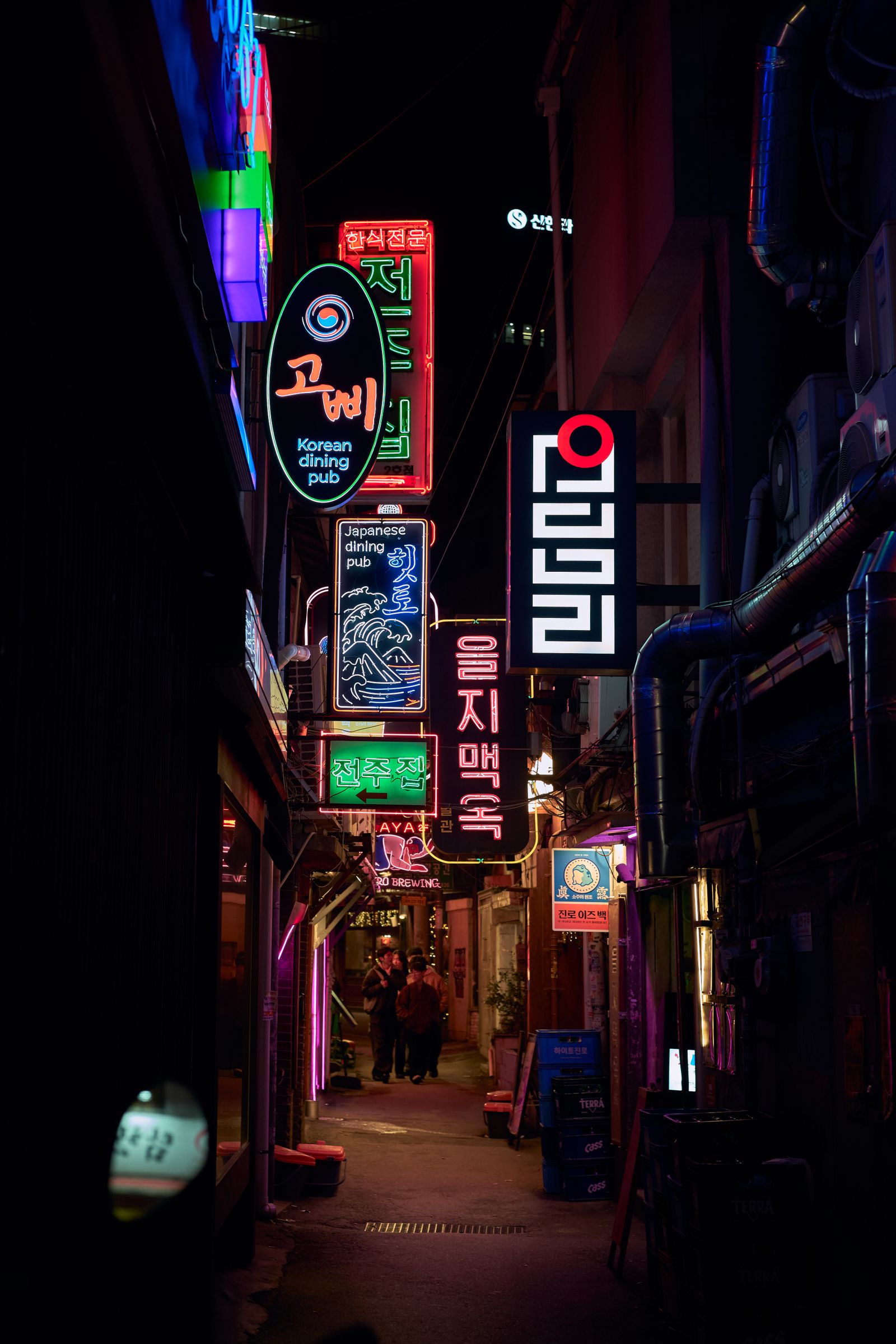
The art wave. Contemporary Korean artists and calligraphers push Hangeul beyond print: brush-style calligraphy on film posters, neon Hangeul installations, media art that animates syllable blocks, and museum identity systems built entirely on the alphabet's geometry.
Read the shapes you admire: As an Amazon Associate, EpicKor may earn from qualifying purchases. Hangeul is famously learnable in a weekend; a Korean alphabet workbook with writing practice takes you from admiring the letterforms to actually writing them.
See Korean alphabet workbook with writing practice on AmazonWhy Designers Specifically Love Hangeul
Ask graphic designers what draws them to Korean letterforms and the same qualities come up repeatedly.
- Modularity. Letters compose into syllable blocks, so text naturally forms grids. That makes Hangeul unusually friendly to poster layouts, logos, and pattern design.
- Geometric bones. Circles, squares, and straight strokes are the entire vocabulary. Hangeul reads as minimalist by default, which suits contemporary branding.
- Negative space. Because each block must balance internally, Hangeul typography plays constantly with density and emptiness, a very Korean aesthetic that echoes traditional architecture and ceramics.
- Meaning as texture. For non-readers, Hangeul functions as pure abstract pattern; for readers, the same design carries language. Dual-audience design is rare and valuable.
- A story to tell. "This alphabet was invented in 1443 so common people could read" is a brand narrative no committee could write better.
Where to Experience Hangeul Design in Korea
You can treat Hangeul design as a full itinerary theme in Seoul, and it pairs naturally with the city's stationery and museum-shop culture.
| Spot | What You See | Tip |
|---|---|---|
| Gwanghwamun Square | King Sejong statue and the underground Sejong story exhibition hall | Free; combine with Gyeongbokgung across the street |
| National Hangeul Museum (Yongsan) | The alphabet's history and design as a dedicated museum | Check current hours and exhibitions before visiting |
| Large bookstores (Gwanghwamun, Gangnam) | Contemporary Hangeul cover typography at scale | The stationery floors sell Hangeul-print goods |
| Insadong / Ikseondong | Hangeul calligraphy shops, brush art, and lettered storefronts | Look for hand-lettered signs on tea houses |
| Museum gift shops | Hangeul-pattern souvenirs done tastefully | Our picks are in the museum shop guide below |
For souvenir hunting specifically, the best Hangeul-design objects, from consonant-shaped bookends to syllable-pattern scarves, cluster in museum shops and design stationery stores. We keep updated picks in our Seoul museum gift shop guide and our Seoul stationery shopping guide.
Reading Korean Typography Like a Local
Once you start noticing Hangeul design, a little vocabulary sharpens the eye. Korean typography historically divides into two great families. Myeongjo faces are the serif tradition: brush-influenced strokes with flared endings, used for novels, newspapers, and anything that wants literary gravity. Gothic (dotum) faces are the sans-serif tradition: clean, even strokes that dominate screens, signage, and corporate identity. Nearly every piece of Korean graphic design you admire is choosing a position between those two poles, exactly like serif versus sans-serif decisions in Latin typography.
Two more details reward attention. First, watch how designers handle the syllable block grid: strict, evenly-sized blocks read as orderly and institutional, while type that lets letters break the grid, stretch, or overlap reads as young and expressive. Korean indie album covers and cafe logos love breaking the grid precisely because school textbooks never do. Second, notice batchim, the final consonants that sit at the bottom of syllables. They give Korean text its distinctive bottom-heavy rhythm, and skilled logo designers exploit them, tucking a tiny ㅅ or ㄹ like an architectural detail.
You do not need to read Korean for any of this. Treat a walk through any Seoul neighborhood as a gallery visit: convenience store logos, bus stop ads, hand-painted market signs, and luxury flagship facades are all making deliberate Hangeul typography choices, and the range from brush calligraphy to brutal geometry is visible in a single block.
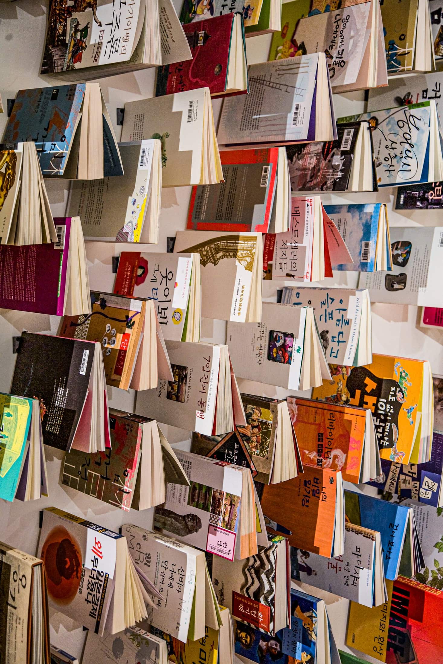
Getting a Hangeul Tattoo or Print? Read This First
Single Korean words like sarang (사랑, love), kkum (꿈, dream), or haengbok (행복, happiness) are popular tattoo and print choices for their minimalist look and clear meaning. Two practical cautions. First, verify spelling and nuance with a native speaker, not a translation app; Korean particles and spacing change meaning, and the internet is full of grammatically odd Hangeul tattoos. Second, consider typography deliberately: the same word reads completely differently in a brush script versus a geometric sans-serif, and a Korean type-savvy artist can show you options.
If you want the meaning without the permanence, Hangeul calligraphy classes in Insadong let you brush your own word in an hour, and the result makes a better souvenir than most shop-bought prints.
From letterforms to language: If the design pulled you in, the words will keep you. Browse Korean literature in translation and pair one novel with the alphabet you just learned to read.
FAQ
Q: Who created Hangeul and when?
Hangeul was created under King Sejong the Great, completed in 1443 and promulgated in 1446 via the Hunminjeongeum. Historical records credit Sejong directly, working with scholars of the royal research institute, the Jiphyeonjeon.
Q: Why is Hangeul considered scientific?
Its basic consonants diagram the speech organs making each sound, related sounds share visual bases, and vowels build from a consistent three-element system. The design was documented in the Hunminjeongeum Haerye, so the logic is verifiable, not legend.
Q: How long does it take to learn to read Hangeul?
Most learners read slowly within a weekend; the alphabet has 14 basic consonants and 10 basic vowels with highly regular rules. Reading speed and vocabulary take longer, but the script itself is famously beginner-friendly.
Q: Is Hangeul the same as Korean?
Hangeul is the writing system; Korean is the language. You can transcribe other languages in Hangeul, and Korean was historically written in Chinese characters before Hangeul became standard.
Q: What is Hangeul Day?
October 9 is a South Korean national holiday commemorating the promulgation of the alphabet. Expect exhibitions, calligraphy events, and Hangeul-themed releases from Korean brands around that week.
Q: Where can I see the original Hunminjeongeum?
The Haerye edition is held by the Kansong Art Museum in Seoul and appears in special exhibitions; the National Hangeul Museum in Yongsan covers the script's full story year-round. Check each institution's current schedule before planning a visit.
Sources
You Might Also Like

Korean Proverbs Guide: Kimchi Soup, Tigers, and Everyday Wisdom
A beginner-friendly guide to Korean proverbs, explaining kimchi soup, tiger, lamp, needle thief, and speech sayings in real cultural context.

Learn Korean With Hangeul: Alphabet, Honorifics, and Apps
A beginner-friendly guide to Hangeul, Korean pronunciation, honorifics, study apps, and realistic ways to start learning Korean.
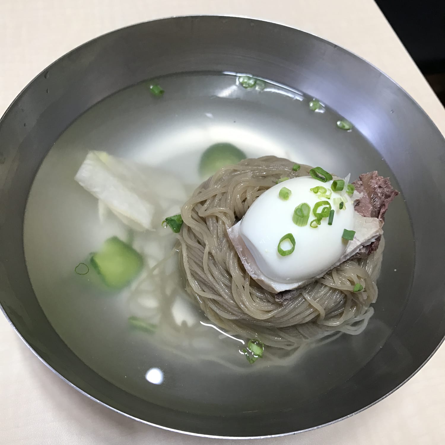
The One Korean Food Foreigners Never Learn to Love: Hamheung Naengmyeon, and Why Koreans Can't See the Problem
Foreigners who eat cheonggukjang and even hongeo still will not pay for this twice. A Korean creator who fed foreigners for years says naengmyeon was the overwhelming number one refusal, and Koreans, who rank it first every summer, cannot see why.